UNDERCOVER
Part II of an exclusive three-part interview conducted by Mark A. Stevens of MAS Communications LLC and Rex Saldaña, Eurythmics Video Visionaries webmaster, over Zoom between the USA & London, England, on Wednesday, 25th November 2020, with Laurence Stevens.
Laurence is Eurythmics’ Graphic Designer & Creative Director. Part 1 of this interview appeared on the Eurythmics Video Visionaries website Archives website and Part III will follow there in the coming weeks.
★
Laurence
Stevens
Part 2


MARK
Let’s talk about iconic album covers. As you move from “Sweet Dreams [Are Made Of This]” to the “Touch” album, which I think in one sense because of the typography, that’s the band’s iconic sleeve.
I want to know the genesis of that — the block capital letters, the star, all that.
Laurence
Yes I can see the actual logo that you are referring to printed on the “Touch Dance” poster on the wall behind you Rex. Well, when “Touch” was about to be released, I did think that based on the success of “Sweet Dreams (Are Made Of This)” that this is going into a bigger success scenario.
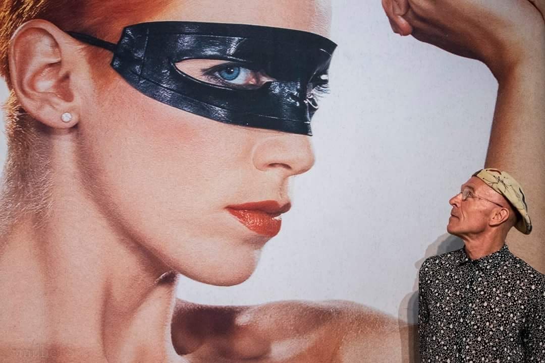
“Sweet Dreams (Are Made Of This)” had just been #1 in the States, but it was just the beginning of everything really. With the “Touch” album, the front cover image was actually shot by Peter Ashworth for an editorial in The Face magazine, which at the time was a hugely influential and important style/fashion/music magazine here in the UK. So the image of Annie that I eventually used on the front cover of the album sleeve wasn’t shot specifically for the “Touch” album at all. I remember that Annie and I sat down together at RCA Records, in the Art Dept funnily enough … and looked at the session that Peter had shot on the lightbox, and Annie just kind of said, “Well, which shot do you like?” at the exact same time that we both put our fingers on the same transparency!!!


What I was saying earlier, was then we used to do a photographic shoot and select an image from that shoot that we felt may be right for the single or for the album sleeve. Now, I work with acts, and we do a shoot that is specifically for the album or for the two singles. So back then, we just did a session and then we would select the images from that session.
Previously, in the earlier sleeve designs and graphics that I’d created for Eurythmics, even though the bands name was always a strong and bold sans-serif typeface, it wasn’t an actual logo as such, it wasn’t something that you would recognise as Eurythmics. I had started to use stars and dots, and little lines as graphic elements in my work .
All of the main lettering, band logos, main titles etc … were all created by hand using a dry transfer rub-down graphic lettering product called ‘Letraset’. Are you aware of ‘Letraset’? Do you know what ‘Letraset’ is? It’s dry transfer lettering. So you would buy a sheet of Helvetica Bold or Gill, or any other classic typeface, and it would be a full alphabet set in the exact font, lots of capital and lower case letters, vowels, etc … occasionally it would be a problem if you needed a final letter A to finish a job and you had used them all off of the sheet!!!
So at that time in order to make the typography and lettering ‘bespoke’ to Eurythmics, everything I did – even with “Love Is a Stranger” and “Sweet Dreams [Are Made Of This]”” – all the typography on the back of those two singles was rubbed-down using the Palace Script typeface, which as you can imagine took a lot of work to do. This process allowed me to cut the letterforms up, reverse certain characters, put small dots and lines into the sentence as though I was creating a typographic painting.
There was no way that a typesetter at the time would have done this for me, they just wouldn’t have understood it, as typesetters and printers at the time were very ‘old school’ – even my typographic teacher at art college used to really swear at me for cutting up classic fonts and making up different letterforms!!! So again, thinking about it now, I was trying to make sure that even the credits and legal lines on Eurythmics artworks looked different and were also thought out and designed properly for each format.
★
MARK
Early in my career I used those, but I didn’t recall the name that you were using. Literally we would make headlines with that (at my high school newspaper).
Laurence
Yes that’s right. It really allowed me to create exactly what I wanted typographically, even though it was an incredibly long process to do. The obvious example of using this technique can be seen quite clearly on the reverse of the “Touch” album sleeve. I specifically set each song title using a number of different fonts and typefaces, mixing and matching and cutting up the letters, using capitals with lower case etc …
As I said to set that digitally, it just wasn’t possible to do. You’d be asking your typesetter to set a word, but you’d be asking him to use eight different fonts in one word and they just wouldn’t do it. They would have thought you were mad, you know, and at the time, I couldn’t afford to get a typesetter to do the typesetting for me. So I had to use this. That’s how I created the typography, using the rubdown letter transfers. Also, instead of having to think of exactly how I wanted the song title to look, I could just create it literally at the time that I was designing the sleeve and doing the artwork, creatively thinking ‘on the spot’ as it were.
And as I said, if I’d used up all of the capital A letters from one sheet, I’d have to use another letter and make it work from a different type sheet. That’s why it looked so original I guess, no other set of song titles in the world looked like that ….

So going back to your original question about the design of the Eurythmics logo that I created for the “Touch” album. I remember going to meet Dave and Annie at ‘The Church’ which was the recording studio that they had created in an old church in Crouch End, North London. I had designed a series of 6 x new Eurythmics logos, all on one sheet, using ‘Letraset’ featuring little stars above the bands name, a vertical column above a letter, a forward dash above another, upper and lower case letters…. and I said to them, “Look for the “Touch“ sleeve, I think that we could have a strong recognisable logo, rather than just using your name as Eurythmics”. And Dave, being Dave, said “Ok what have you got”. So I presented the new logo ideas there and then, and Annie just looked at them and put her finger on design #03, and said, “OK, that one!” It was literally like that.
I increased the size of the logo that Annie had selected, and placed it on the crop of Peter Ashworth’s amazing image that I’d already started to work with for the design, and instantly it looked great, it just worked immediately on the rough visuals, just looked like it fitted. Originally the logo design that Annie had selected was just black and white because I’d created it using the black ‘Letraset’ letterforms. But because of the colour of Annie’s hair in Peter’s photograph, the colour of the leather eye-mask that she was wearing, the flesh colour of her clenched fist, just adding a ‘red star in the new logo above the letter S just seemed to make sense and balance it all off visually – the little bit of red on the star really just brought it to life. So yes the ‘red star’ was specifically added to the album logo, but as I said that logo was one of half a dozen that I put together. It’s interesting, you say, because now going through the archives, even now I look at things, I kind of smile about how it was created and how I did it and think actually, well, maybe if it was in a design book with an explanation of how it was created, you know the before and after, that people might be interested in seeing the original rough designs now, 35 years down the line.

It’s very nice to speak to you guys about the importance within everything about the band – the clothes, the videos, the graphics, everything. That’s what makes a great product and a great band. I mean, who would have thought at the time that that logo would go on to become so recognisable?
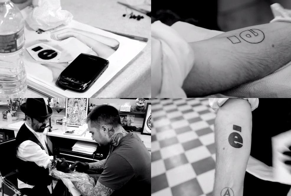
Funnily enough, I was working with Dave last summer, because he was performing the ‘Eurythmics Songbook’ at the ‘MeltDown Festival’ here in London, and he’s actually got the lower case ‘e’ with the horizontal bar from the logo tattooed on the inside of his arm. How crazy and wonderful is that?
But from that original logo, created all that time ago, the ‘little red star’ has definitely become a very recognisable Eurythmics monogram.


★
MARK
Laurence
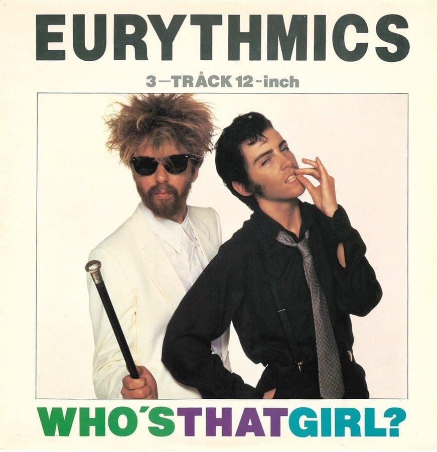
That song was to be the first single off of the “Touch’ album, and Dave and Annie had a very strong visual idea for the video treatment which we recreated for the photo-shoot. Actually, thinking about the imagery for the video and single sleeve now, 38 years later … can you believe that … it was really a strong and creatively brave thing for a female artist to do at the time. I really loved the final shot at the end of the video where Annie, as a male version of herself, kisses a female version of herself … how modern and relevant is that, especially today?
Funnily enough, if you blink you’ll miss it, but I’m actually in the WTG? video. Annie and I are shot from behind leaving the club holding hands. Annie is wearing a white fur stole and I have a dark grey suit on, which is a ref to the following shot where Annie is seen leaving the club, shot from the front this time with the male version of herself.

Anyway I digress, we did the photo-shoot with Lewis Ziolek for the single sleeve, who we’d previously used on the “Sweet Dreams [Are Made Of This]” photo session. Annie and Dave just wore the exact same outfits for the stills shoot that they had worn for the video. I really loved that track, I think it’s one of Annie’s great lyrics too. Apart from Annie’s ‘playing with gender’ look for the video, I think the whole look was partly to do with the fact that in the US as you know, when they released “Sweet Dreams [Are Made Of This]”, apparently people didn’t know if Annie was ‘a man or a woman’ … so I think Annie took it one stage further and just happily, and rather cleverly, created a ‘boy version’ of herself. As you know, this is how they performed at the Grammy’s, amazing really.
Dave actually told me a funny story about when they appeared at the Grammy’s with Annie dressed as her ‘male version’. Apparently, after their performance, Dave and Annie were standing around backstage and Elvis’s actual manager Colonel Tom Parker came up to Dave and introduced himself saying that he thought that their performance was just great and that if they got rid of their manager he could make them big stars.
I think he thought that Annie was actually Elvis re-incarnated!!! I also think that Annie was just artistically enjoying creating different characters for herself at the time. Remember MTV was just getting huge, and they wanted to play a different style/look video for each single release, so Eurythmics were just perfect for that, because each of their videos was just so different and Annie and Dave created such great ideas and looks for their videos. Also in my mind, creatively, for the sleeve design I did like the idea of the Who’s That Girl? song title, and then underneath it, having a picture on the cover of two people who were both clearly men … Just as an aside, it always intrigued me ’typographically speaking’ that when Madonna released her track “Who’s That Girl” a few years after Eurythmics, that Madonna’s title didn’t have the correct punctuation of a ? at the end of the title, I’ve always wondered why that was the case – just a weird thing that graphic designers think about I guess!!!

★
MARK
Laurence
I guess that you’re referring to the characters that I used on the original design of the vinyl labels that I created at the time Mark?

The actual graphic figures of boy/girl, boy/girl, were taken from an old Letraset dry transfer sheet that I had found at art college. As I explained earlier, I really loved using Letraset typefaces and the graphic symbols that you used to get on those sheets; stars, numbers, crosses, lines etc … I would cut them up and manipulate them into something new to fit the graphics that I was creating for the band.
(We have managed to locate the original sheets that Laurence would have used. Letraset Art Sheet reference AA21 and AA11 below, you can see the 4 figures used)


It was instant, I could create an idea immediately and then use it on the final board artwork. I think that originally those figures were supposed to be used on architectural drawings to illustrate crowds and people, I just really liked the austere and 1950s modernist look of them. Again I was just misappropriating something, must have been my punk ethic I guess!!!
The figures just seemed to fit with the DnA oval logo for some reason, and it was a retro style that was happening graphically at the time too. I also liked the idea of introducing some characters into the graphic design that weren’t actually Dave or Annie, it seemed to work as bringing in a kind of ‘indie label’ feel as well to the product. I’m not sure if the fans are aware or not Mark, but I began using the Letraset figures/characters in those early releases, on the vinyl labels, as at the time each release had a DA Catalogue Number – “Love Is a Stranger” was DA 1 and so on … so again it was injecting something personal and independent to the look of the vinyl labels.

★
MARK
Regarding the reissues that you did about in 2018 – specifically “1984”, you did something a little bit different on that, like you switched up the font up at the top. Was there a reason for that?
Laurence
It’s very interesting that you guys spotted that or even noticed that.
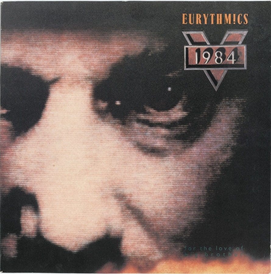
Again that was a slightly complicated period and release for the band. You obviously know the story about all that, why that album was released on Virgin and the fact that the music actually never appeared in the movie? I was never happy with the way that they ‘played about’ with the Eurythmics logo (on that original “1984” album cover). They didn’t use my official Eurythmics logo on that sleeve it was something that Virgin did. So I never liked it. To me, at that time it didn’t look like an official Eurythmics album release. It didn’t have an image of Annie or Dave on the cover for one thing ….. for obvious reasons, it was just created to promote the movie, hence the huge film “1984” logo on the sleeve.
Again I wasn’t involved with the design of the original “1984” sleeve, it was between Virgin and the film company at the time, it all got very political. In my opinion the original sleeve didn’t have any Eurythmics aesthetic about it at all, that it would have had if I’d obviously designed it. The only way you could tell that it was an album by Dave and Annie was that it had the ‘word’ Eurythmics on the front. It should have been designed properly, but as I said for political and in-fighting reasons with the parties involved at the time I wasn’t part of it.
So when they were asked to re-release the album for RSD [Record Store Day] it was my opportunity to finally make it look like a ‘proper’ official Eurythmics album release.
REX
And you also added the ‘red star’ in the logo.


Laurence
I did, yes. It’s interesting you should say that, because as we mentioned earlier that the ‘red star’ has become the recognisable Eurythmics symbol and I thought adding the ‘red star’ would make it an official Eurythmics album, and also for obvious reasons the ‘red star’ is definitely a 1984 type of dictatorship symbol, so it fitted really well. So, yes, I did use that. Also, if you notice I went back to using the original block sans-serif font to create Eurythmics, instead of using the “Touch” logo that we mentioned, it just seemed to fit better with the TV screen image from the movie. And also creatively, I did like the way that the ‘red star’ worked placed in-between the letter V.
I got some great feedback actually from that sleeve design. A lot of people really liked it. I was allowed to re-design the back cover, and both sides of the inner sleeves, as well as the special 12” vinyl paper . So we did a RSD, limited edition, ‘red vinyl’ disc for it, as well, which Annie really loved. I’m pleased to say that both Dave and Annie really liked the revised sleeve, luckily for me!!! We did get some really good feedback from how the sleeve now looked, even from the record company. I think, hopefully it was because it was done properly and people just thought, you know, it was worth having in their Eurythmics collection, and also the fact that the album was now available again to buy.


REX
You know, the remastered audio on the “1984” is unbelievable. It’s really great. I am hearing things I didn’t hear before.
Laurence
Yeah, I mean, well that’s down to Dave’s production skills and remixing. I mean, some of those tracks, the drumming that they would use and the synth sounds, just fantastic.
Now, you know, it’s a really a great album, and for them to go out and make an album like that right in the middle of a huge American stadium tour when the band where most probably at their most commercial stage, is really brave and wonderful – you just know that they are both so talented that, that’s why it’s been successful for so long.
MARK
Laurence
Peter Ashworth, who shot the album cover image that we used on “Touch”, shot some really great stills of Dave and Annie while we were shooting the video, which funnily enough I ended up using in the re-design of the 2018 sleeve. … In the end with the special Record Store Day reissue, I was able to work on the design, so it kind of worked out in the end … it only took 38 years!!!
★
Laurence
Stevens
Design


Parts 3 and 4 of our interview with Laurence will be published in the coming weeks on the Eurythmics Video Visionaries website. Be on the lookout for them!

Follow Laurence on Instagram where he is currently sharing published and unseen artwork from his career, including many highlights of his work with dave and annie


